Colour Mixing Tips
For Artists, How to Mix Colours on Artist Palette, Combine Paint Pigments.
MAIN A-Z INDEX

Pin it


The Colour Wheel

30 Colour Mixing Tips For Artists
How to Mix Colours When Painting

Here, we are concerned not with the theory of colour, but rather its practice: that is, how to combine pigments in order to obtain the required hues, or tints/shades of a particular hue. Even so, a knowledge of the colour wheel, along with an understanding of the difference between primary, secondary, and tertiary colours will make your colour-mixing a lot easier, as will a grasp of complementary, warm and cool colours.

Basic Colour Mixing Tips
Optical Colour Mixing Tips

COLOURS IN FINE ART
For a guide to the use of pigment
by painters, the impact of chemistry
and paint manufacturing techniques,
famous colourists from Renaissance,
Baroque, Impressionist, Fauvist and
contemporary periods, see:
Colour in Painting.

COLOUR PIGMENTS
For an A-Z list of important artist
pigments, from Antiquity through
Medieval times, Renaissance, Baroque,
Impressionism and Modern Art, see:
Colour Pigments: Types, History.
For the definition and meaning of
colour terminology in painting, see:
Colour Glossary For Artists.


For information about the concepts
and ideas involved in colour, see:
Colour Theory in Painting.

HISTORY OF COLOUR PIGMENTS
For details of pigments, dyes and
colours associated with different
eras in the history of art, see:
Prehistoric Colour Palette
Hues used by Stone Age painters.
Egyptian Colour Palette
Hues used in Ancient Egypt.
Classical Colour Palette
Pigments used by painters in
Ancient Greece and Rome.
Titian and Venetian Colour Painting
How Tiziano Vecellio Handled Colour
Renaissance Colour Palette
Colourts used by oil-painters and
fresco artists in Florence, Rome
and Venice.
Eighteenth Century Colour Palette
Hues used by Rococo and other
artists.
Nineteenth Century Colour Palette
Pigments used by Romantics,
Impressionist painters and
other 19th century artists.

Basic Colour Mixing Advice

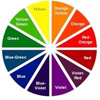
Colour Mixing Tip 1. You Can't Mix Primary Colours
When combining colours to obtain new hues, there are three basic colours that cannot be made by mixing other colours together. Known as primary colours, these are red, blue, and yellow.

Colour Mixing Tip 2. What Happens If You Mix Primary colours?
If you combine two primary colours, you create something called a secondary colour. For example, mixing red and blue produces purple; yellow and red makes orange; blue and yellow combined make green; red and blue make purple. The exact tint or shade of the secondary colour you create depends on which red, blue, or yellow you use (light or dark), and the proportions used. If you mix three primary colours, you get black.

Colour Mixing Tip 3. Which Specific Primary Hues Should I Mix?
It depends what secondary colour you want and what tint or shade of that colour you're aiming to create. Mixing a deep cadmium yellow with red ochre produces a slightly different orange from that created with a titanium yellow. Basically, each differing pair of primary colours will produce a differing secondary.

Colour Mixing Tip 4. Judging How Much of Each Primary colour To Use
The exact proportion of (say) red-to-yellow you mix when creating orange will determine the exact type of orange you get. For instance, if you mix more red than yellow, you get a reddish orange; if you add more yellow than red, you get a yellowish orange. Play around with the colours you have and try out different combinations and proportions. Just remember to keep a record of your experiments!

Colour Mixing Tip 5. Can I Buy Pre-mixed Reds, Blues and Yellows?
Yes. Nowadays you can buy a very wide range of primary reds, blues, and yellows, like: cobalt blue, caribbean blue, cerulean blue, Prussian blue, and Sevres blue, among others. Types of red include alizarin crimson, cadmium red, cadmium scarlet, carmine, and Venetian red, to name but a few; while yellows include cadmium yellow, Naples Yellow, lemon yellow and yellow ochre.

Colour Mixing Tip 6: For The Brightest Colours Use Single Pigments
For the most intense, luminous results, use the minimum number of pigments. Ideally, make sure that the two colour paints you are mixing are each made from one pigment only. If in doubt, check the label: most "Artist Quality" paints itemise the pigment(s) used.

Colour Mixing Tip 7. How to Get Tertiary Colours?
Mixing a primary and a secondary colour (like red + green) or two secondary colours (such as orange + green) produces something called a tertiary colour. The latter, in particular, results in muddy colours - browns, greys and blacks. Tertiary colours like Blue-Purple, Yellow-Green, Green-Blue, Orange-Yellow, Red-Orange and Purple-Red are all created by combining a primary with a secondary colour.

Colour Mixing Tip 8: Always Add Dark to Light
When combining colours, remember that it requires only a small amount of a dark colour to change a light colour, but it needs a lot more of a light colour to change a dark one. So, always add dark (eg. blue) to light (eg. white), not vice versa.


Colour Mixing Tip 9. How Do You Get White or Black?
Although these two are used to lighten or darken colours, neither are used to "create" colours, so they are not usually included in colour mixing theory. Most painters buy specific white or black paints, although it is possible to create the colour black by combining red, blue and yellow (or cyan, magenta and yellow).

Colour Mixing Tip 10: Always Add Opaque to Transparent
Similar to the situation when mixing dark and light, remember that only a small amount of opaque colour is needed to change a transparent one. So make a point of adding opaque to transparent, not vice versa.

Colour Mixing Tip 11: Mixing Complementary Colours
Each primary colour - red, yellow, blue - has it's own, exclusive, complementary colour (its complete opposite in colour theory terms), which sits opposite it on the colour wheel. Thus blue and orange are complementary; as are red and green, purple and yellow. A primary's complementary is made by mixing the other two primaries. However, take care when placing a primary colour next to its complementary hue on a canvas. This is because their totally different wavelengths can cause problems for the eye and create optical distortion. On the other hand, placing complementary colours next to each other tends to make each other appear brighter and more intense.

Colour Mixing Tip 12: Don’t Mix Colour Too Thoroughly
When combining two colours on your artist palette, don't mix them too completely. Don't wait until you have a totally consistent blend result. You get a much better and more interesting effect by briefly mixing them, and then applying the mix to the canvas.

Colour Mixing Tip 13: Mixing Warm and Colours
Each hue is considered to be either slightly "warm" or slightly "cool". For instance, as a group, yellows and reds and considered to be warm colours, while blue is cool. Furthermore, within each colour there are tints and shades which are warmer or cooler within its colour group. So you can have a "warm" sky blue, or a cool lemon yellow, although yellows will typically remain warmer than blues. The point is, mixing two warm colours produces a warm secondary, while adding (say) a warm to a cool colour yields a more neutral effect.

Colour Mixing Tip 14: How to Create a Clean Green
To create a clean green colour, add Phtalo Blue to Lemon Yellow.

Colour Mixing Tip 15: How to Create a Muddy Green
To create a muddy green colour, add Ultramarine to Lemon Yellow.

Colour Mixing Tip 16: What's the Best Palette For Making Clean Colours?
A good fine art palette for creating clean colours might contain the following paints: Cadmium Red (yellow-shade red); Permanent Rose (blue-shade red); Phtalo Blue (green-shade blue); French Ultramarine (red-shade blue); Viridian (blue-shade green); Phtalo Green (yellow-shade green); Lemon Yellow (green-shade yellow); Cadmium Yellow (red-shade yellow).


Colour Mixing Tip 17: Mixing Greys and Browns
The tertiary colours greys and browns contain all three primary colours. They are made by combining either all three primary colours, or alternatively a primary and secondary colour - remember, secondary colours are composed of two primaries. To obtain the required tone, experiment by (say) mixing different combinations (and proportions) of the three primaries.

Colour Mixing Tip 18: What's the Quickest Way to Create a Brown?
Consult the colour wheel and mix a primary colour with its complementary. (Remember a primary's complementary is made from a mixture of the other two primaries). For instance, add red to green, yellow to purple, or blue to orange. Each of these combinations produces a different brown.

Colour Mixing Tip 19: How to Make an Earthy Brown?
To create an earthy brown, mix red and green colours.

Colour Mixing Tip 20: What's the Quickest Way to Create a Grey?
Mix orange with blue, then add white. You will need more blue than orange, but play around with white and see how much you need. Alternatively, mix blue with an earthy hue like raw umber or burnt sienna.

Colour Mixing Tip 21: How to Make a Delicate Grey?
To create a delicate grey, add white to red-green mixtures.

Colour Mixing Tip 22: How to Make a Warm Grey?
To create a warm grey, mix purple with yellow.

Colour Mixing Tip 23: How to Tone Down Colours?
If a colour seems too strident you can tone it down either with a complementary colour or with an earth colour. For example, you can tone down reds and greens with raw umber. Or, you can cool down a hot red with a little green. In comparison, adding blck to a colour tends to dull it.

Colour Mixing Tip 24: How to Stop Tertiary Colours Becoming Muddy?
Basically, the more colours you mix, the greater the danger of producing a muddy result. So, if your brown or grey is getting muddy, scrap it and start over, rather than adding more colour.

Colour Mixing Tip 25: Use Pure Colour For Maximum Chroma
For maximum chromaticity (colourfulness/brightness) it's best to use a pure colour rather than a mixed colour. When two pigments are combined, their relative intensity declines. So, for example, if you want an intensed green, use a single green pigment rather than mixing blue and green.

Optical Colour Mixing Tips

Colour Mixing Tip 26: For Brightest Intensity Use Optical Colour Mixing
Optical color mixing is regulated by our "perception" of colour, rather than the mixture of colours on a palette. In other words, instead of mixing two colours then applying the mixture to the canvas, place the two un-mixed single colours next to each other on the canvas and allow the viewer's "eye" to do the mixing. The effect will be similar, except that when the eye mixes the colours the result is usually brighter. This technique of optical colour-mixing (Divisionism) was exemplified in the Pointillism style of the Neo-Impressionist painters Georges Seurat (1859-91) and Paul Signac (1863-1935). See also: Italian Divisionism (c.1890-1907). A modern practitioner is the Irish Impressionist artist Arthur Maderson.

Colour Mixing Tip 27: Juxtaposing Certain Colours Increases Intensity
In order to make bright colours stand out more, place them next to neutral colours on the canvas. For example, a regular red will appear richer and more intense when placed alongside a grey hue. Similarly, a dark tone (eg. dark blue) will intensify if surrounded on the canvas by a light one (eg. lemon yellow).

Colour Mixing Tip 28: Using Glazes For Optical Colour Mixing
Glazing is another method of producing optical colour mixes. For instance, by applying a blue glaze over a yellow ground, the green produced is much livelier than one produced by mixing yellow and blue pigments. This is because light enters the transparent film and is refracted from below, producing a rich, glowing effect.

Colour Mixing Tip 29: Using the Counterchange Technique
Counterchange is the method of placing light shapes against dark, and vice versa. This optical colour mixing technique not only makes the lighter shapes stand out, it creates exta "movement" by leading the viewer's eye from light to dark and back again. One of the greatest exponents of counterchange was the Dutch Realist artist Jan Vermeer.

Colour Mixing Tip 30: How To Create Depth and Space
Another optical colour mixing technique is the juxtapositioning of warm and cool colours. The point is, the eye perceives cool colours as being further away than warm ones. Thus, for example, placing warm earthy colours in the foreground of a landscape painting, and progressively cooler colours towards the horizon, causes the viewer's eye to perceive greater depth in the canvas.

• For information about oils, see: Oil Painting: History, Painters.
• For a guide to watercolours, see: Watercolour Painting.
• For information about acrylics, see: Acrylic Painting.
• For information about colour pigments and painting, see: Homepage.


Art Glossary | Art Types
ENCYCLOPEDIA OF FINE ART
© visual-arts-cork.com. All rights reserved.